The Porcelain Color Spectrum: From Earth Tones to Bold Statements
Color, clay, and light: understanding the porcelain spectrum
Porcelain is often celebrated for its luminous whiteness, that gentle, light-catching surface that makes a vessel feel almost weightless. But the porcelain color spectrum is far richer than a single shade. From sand-washed neutrals and ash-soft browns to deep graphite blacks and rare, saturated notes, porcelain offers a nuanced vocabulary of color rooted in material—minerals, oxides, fire—and the hand of the maker. In this material story, we trace that spectrum and share how a few of our favorite pieces reveal the quiet drama of hue and form.
When collectors speak about color in porcelain, they usually mean one of two things. The first is colored porcelain itself—pigments or stains blended into the porcelain body for color that runs through the form. The second is the world of porcelain glaze colors—transparent, satin, matte, and opaque finishes that filter and transform light. In both cases, the interplay of clay, glaze, and firing produces subtleties that factory finishes rarely match. It’s why a shelf of hand-made porcelain feels alive: not loud, but resonant.
As you explore the pieces below, notice how color shifts with curve, how a crisp rim brightens a tone, and how a satin surface softens it. Whether you’re drawn to a grounded, earthen palette or to bold, sculptural statements, porcelain offers a path to balance—one that elevates a room without overwhelming it.
Meet the makers behind this spectrum in our collections: Chala Toprak, Ilona Golovina, Lucia Mondadori, and Marie-Laure Davy.
Earth tones: from clay to calm
Earth tones in porcelain aren’t about heaviness; they’re about presence. They bring the warmth of raw material into quiet conversation with light—think mushroom, sand, smoke, and fern. These hues feel especially at home on organically contoured surfaces that invite touch.
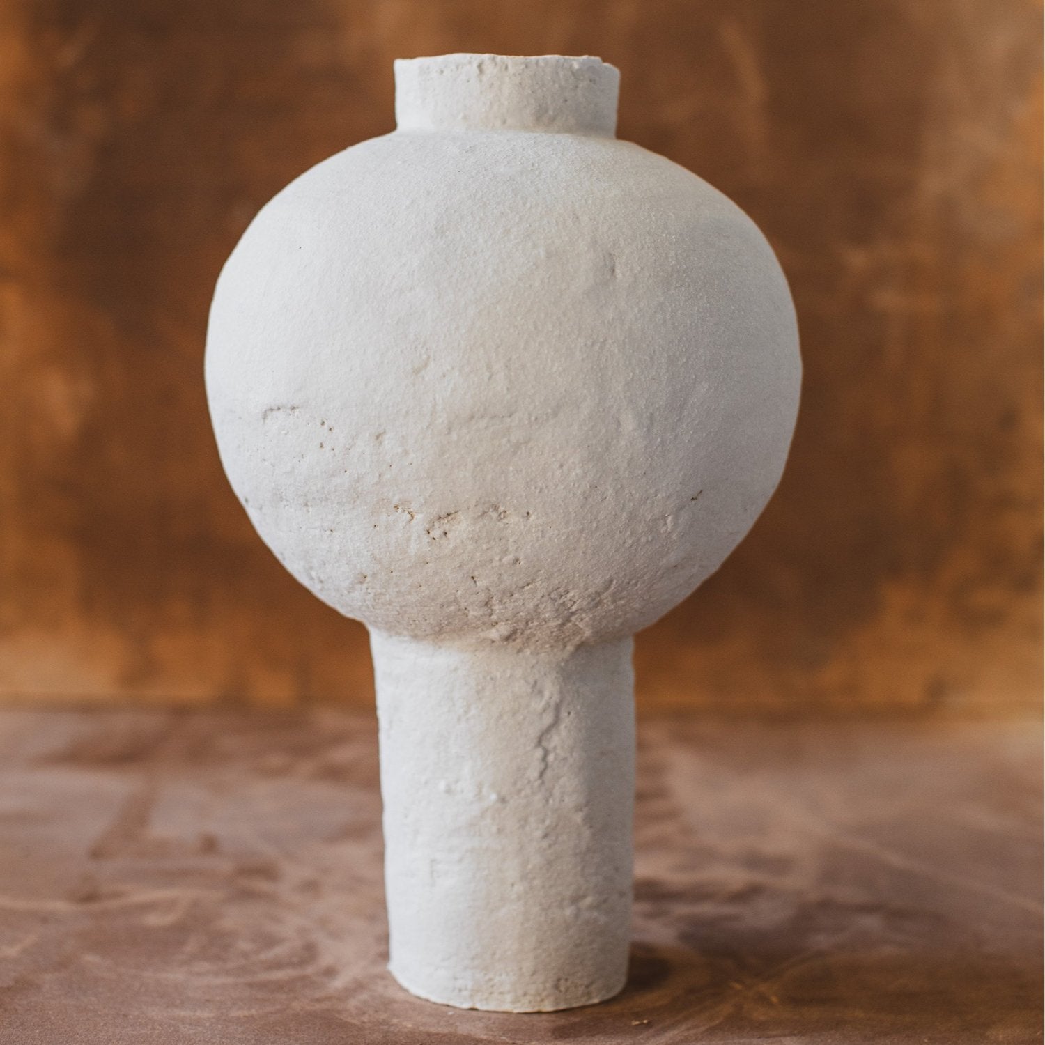
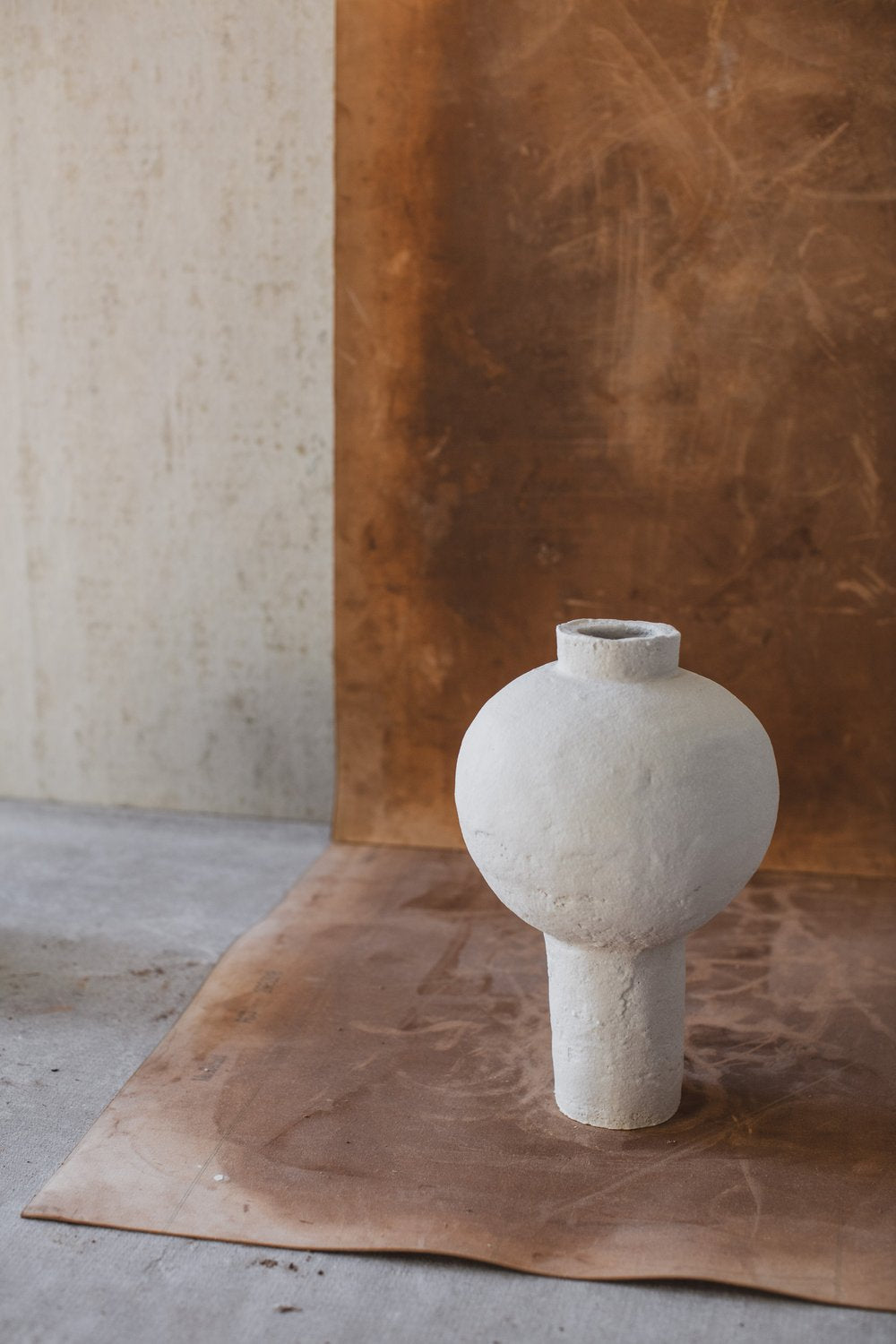
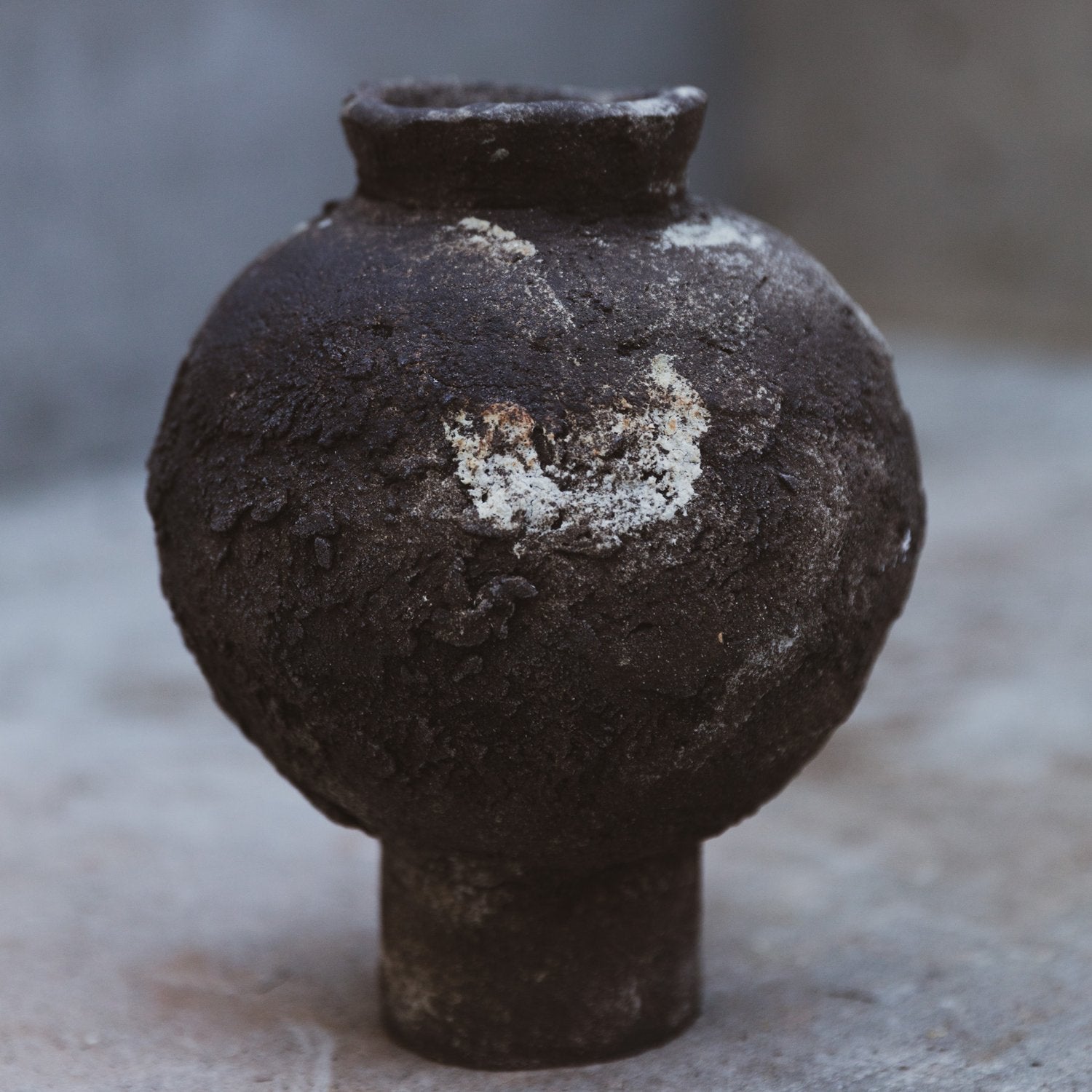
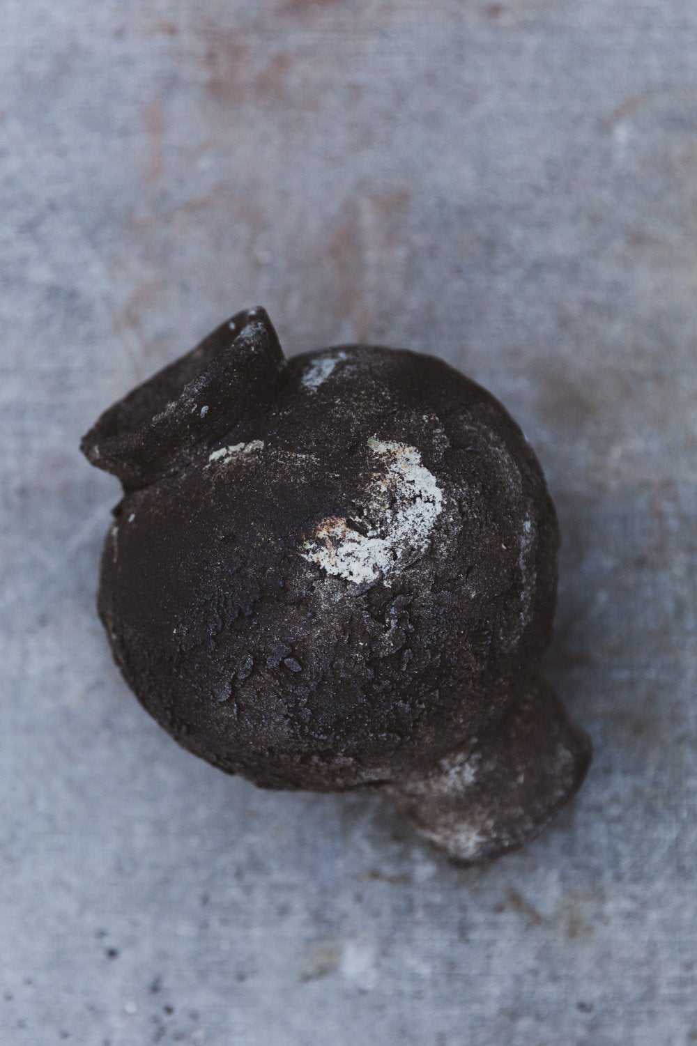
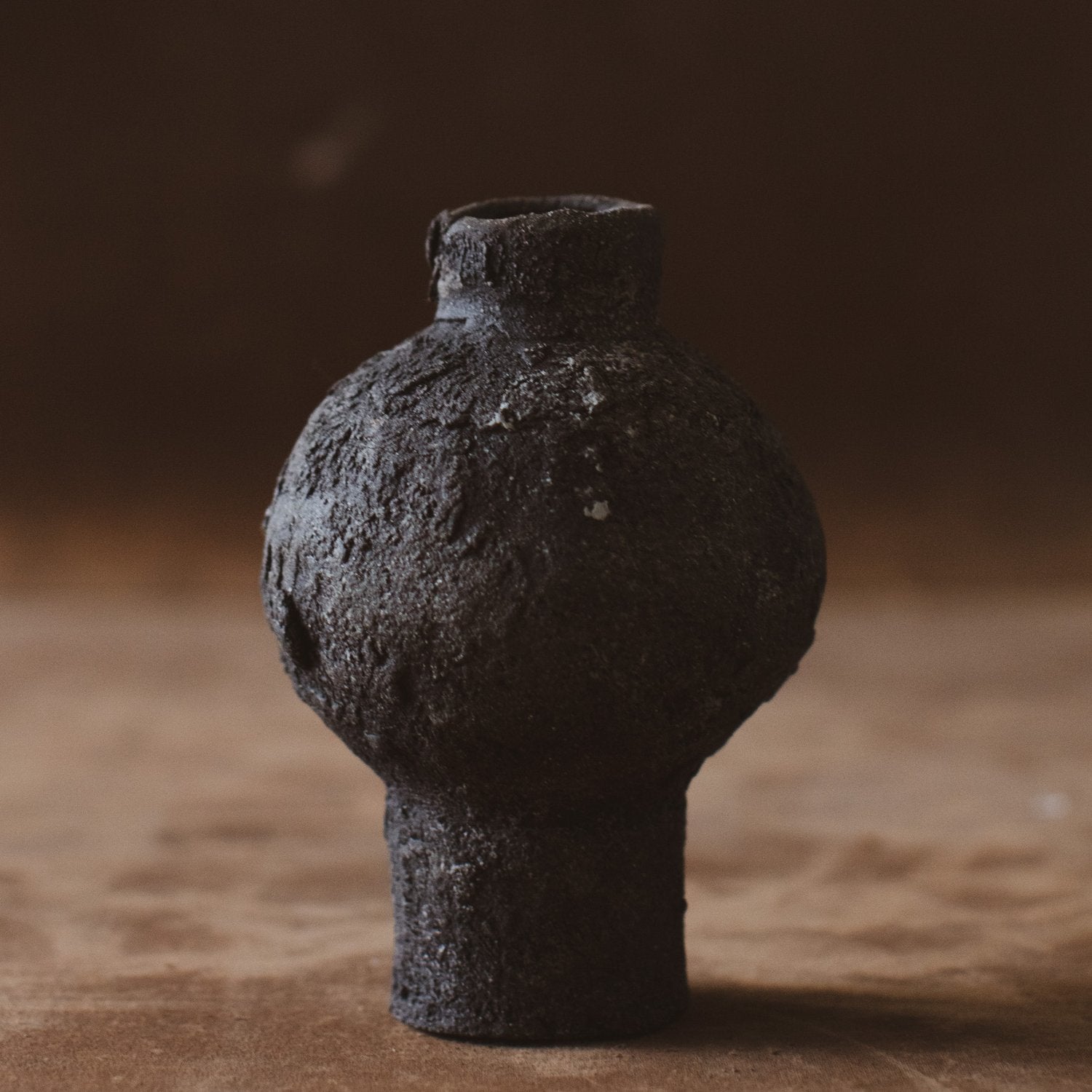
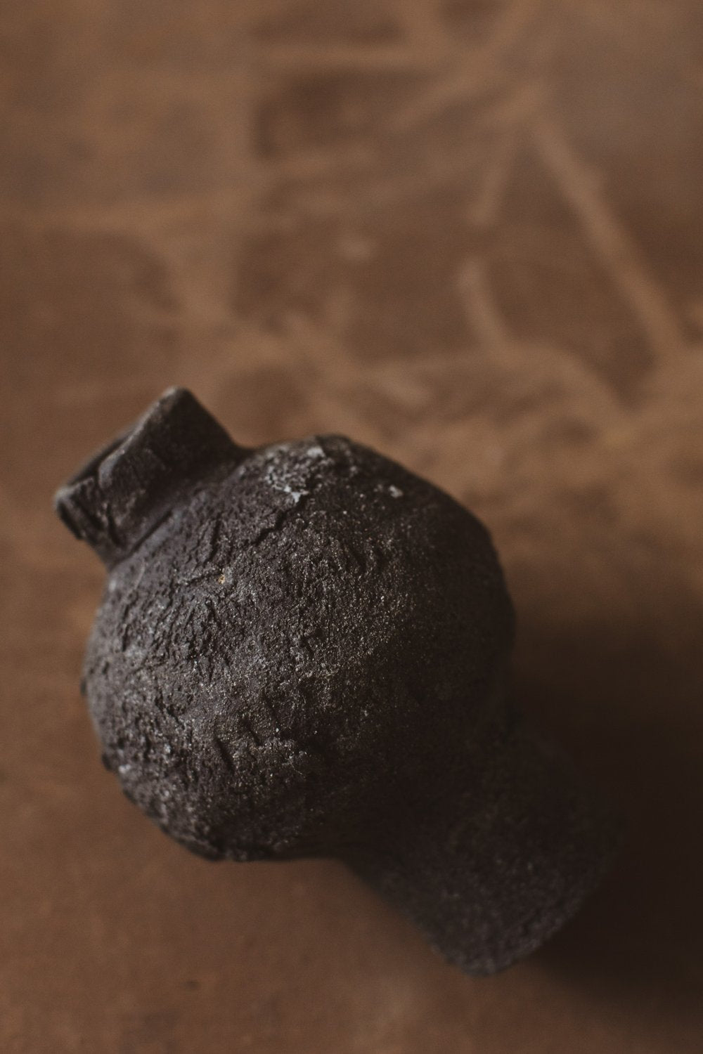
Artist Chala Toprak shares a grounded, ash-kissed palette in two sculptural works. Ash Bloom 02 (USD 1,430.00) gathers gentle umbers and stone-grays across a form that reads like a bloom held mid-movement—soft, meditative, and richly layered. Its companion, Ash Bloom 07 (USD 1,131.00), carries similar tonal depth in a more compact silhouette, a piece that anchors a vignette without stealing it. Together, they demonstrate the magic of colored porcelain and ash-influenced glazing: tones are never flat, but subtly mottled, like lichen on rock after rain.
For intimate glow and atmospheric color, consider Ilona Golovina’s Rocky Glen Votive (USD 450.00). Its softened contours and grounded palette make candlelight feel like a second skin for the form, deepening the browns into velvety shadow. Set it beside an arrangement of seasonal branches and the color story becomes architectural, not decorative.
Two small forms extend this earthy tenderness into everyday rituals. Ilona’s Round Pot with Handles Mini (USD 450.00) and Round Pot Mini (USD 450.00) are vessels that love to be used—on a desk holding brushes, on a nightstand containing jewelry, or simply as quiet sculpture. Their gentle curvature makes even the softest porcelain glaze colors look mineral-rich and rooted.
To bridge neutral tones across a tablescape, we often tuck in a small pedestal. The Compote Vessel Mini (USD 263.00) by Ilona Golovina adds lift and negative space under fruit, small florals, or nothing at all. It’s a study in proportion that makes the earth tones around it breathe.
Whites and neutrals: light as a design material
White porcelain is not a blank—it's a color that harnesses light. In interior design, it’s the hue that clarifies all others and gives the eye a place to rest. When the form is strong, white becomes powerful, not plain.
Ilona Golovina’s moon-jar lineage distills this truth. The moon jar, a classic Korean form from the Joseon era, is known for its generous, airy volume and soft seam where two hemispheres meet. Ilona’s White Tall Moon Jar (USD 1,920.00) channels that spirit in a slender, elongated profile—more column than globe—so the white is not stark but luminous. Pair it with Moon Jar 2 (USD 2,240.00) to create a dialogue of height and breadth; together, the two act like a window for color in the room, reflecting palette back into space.
For smaller surfaces or shelves, Moon Jar Mini (USD 450.00) has the same quiet gravity in a compact format. It sits beautifully on a stack of books, where the pristine white brings crispness to paper edges and linen textures.
White also thrives in functional ritual. The White Candlestick Holder (USD 203.00) by Ilona Golovina contributes a slim column of light to a setting; its refined profile reads almost architectural, and the white glaze amplifies candlelight into a soft halo. Complete the tableau with the Compote Vessel White (USD 525.00), a pedestal that can carry fruit, floral, or sculptural emptiness with equal grace.
Neutrals are most convincing when paired across texture and silhouette. Consider the White Half Moon Jug (USD 1,740.00) alongside the moon jars; its crescent profile adds an unexpected asymmetry that breaks a too-orderly arrangement. Together, they become a study in negative space—whites that reveal their differences as light moves through the room.
Deep blacks and graphite: shadow as color
A saturated black in porcelain is its own kind of brightness. It carries the light in its edges, highlighting a lip or handle where the glaze thins, and it can anchor an airy space without introducing weight.
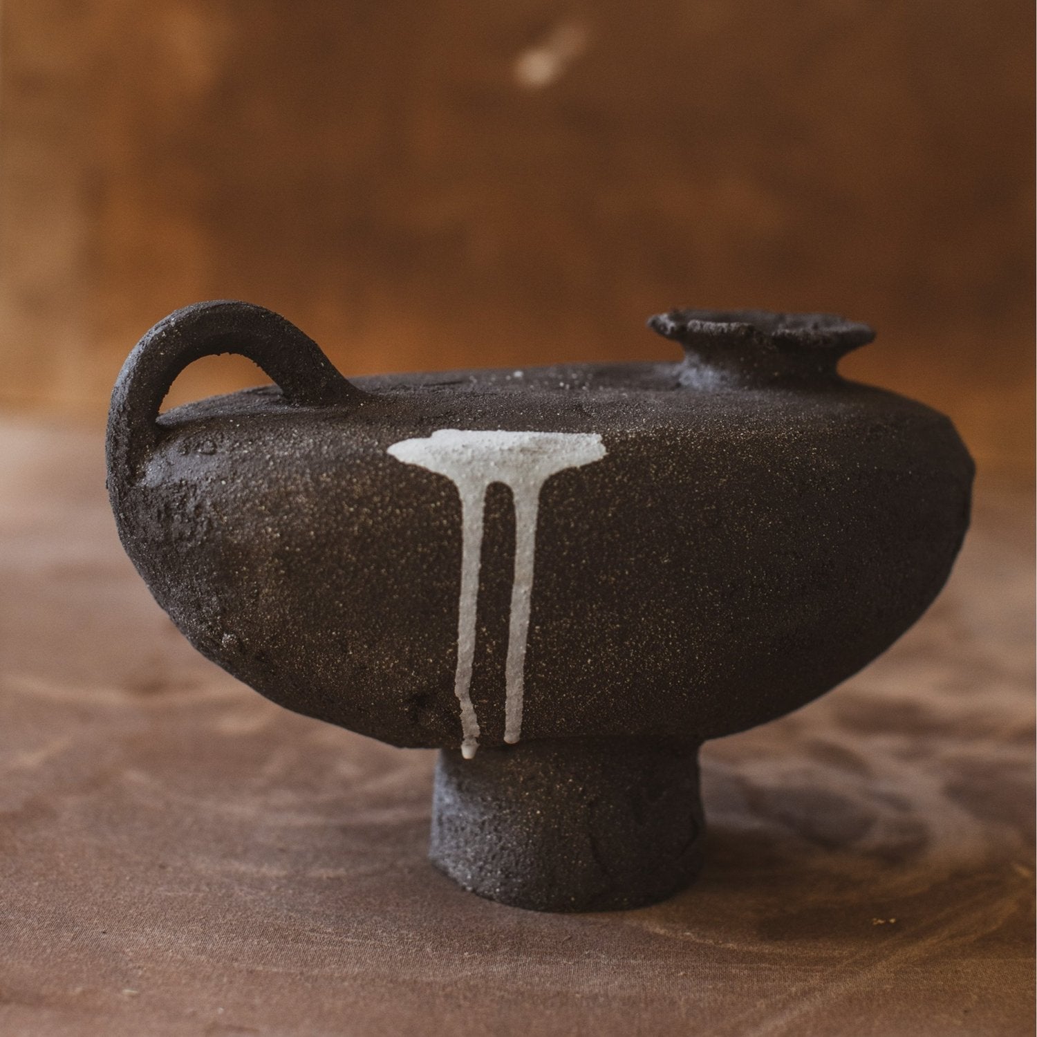
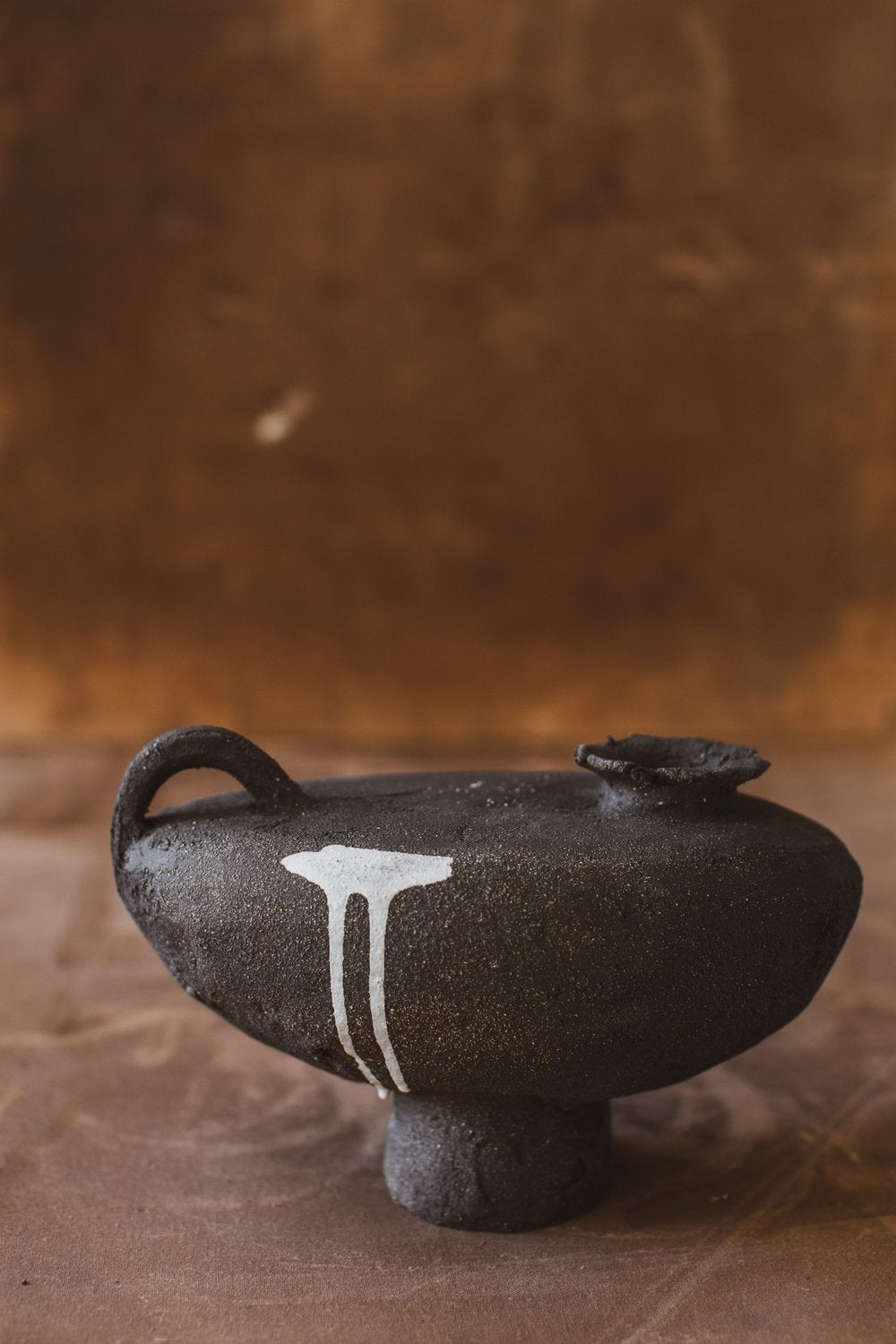
Start with Ilona Golovina’s Black Half Moon Jug (USD 1,740.00), a sculptural silhouette that reads like a single brushstroke turned into volume. The depth of black here is not flat; it’s a velvety field that reveals form—a handle’s arc, a belly’s curve—through the soft reflection it lends to light.
At the table, a pair of candlesticks defines rhythm and shadow. The Black Candlestick Holder (USD 203.00) offers a strong counterpoint to white linens and pale woods. Set two or three in a staggered line and the flame will pick up subtle variations in glaze, proving that even within “black,” porcelain glaze colors can travel from ink to charcoal.
To complete a monochrome vignette, the Compote Vessel Black (USD 525.00) is our go-to. Its pedestal form gives height without heaviness, and when empty, it reads like a perfect circle of shadow—an object that makes surrounding colors sharper by contrast. Try it beside the Compote Vessel White for a yin–yang pairing that keeps the eye moving.
Jewel tones and bold statements: colored porcelain and glaze alchemy
Bold color in porcelain doesn’t always mean loud; it often means precise. A saturated vessel becomes a focal note in a room—like the fragrance of fir in winter; you notice it because everything else is calibrated around it. In studio practice, these hues come from two approaches: colored porcelain (pigment embedded in the clay body) and richly formulated porcelain glaze colors (stains and oxides suspended in a glassy layer). Both demand control in firing to keep color true.
For sculptural presence with modern poise, discover Lucia Mondadori’s vessels. The Layla Vessel N°2 (USD 734.00) and Layla Grande Vessel N°3 (USD 917.00) balance generous curves with crisp edges, so any hue—whether a natural clay tint or a refined glaze—reads saturated yet sophisticated. Place one against a pale wall and you’ll see how even a single tonal shift (from cream to celadon, from blush to smoke) can re-tune a room. Explore more from Lucia in the Lucia Mondadori collection.
Wall sculpture is another stage for bolder gestures. Marie-Laure Davy’s Abundance - Double Base with Drape (USD 4,180.00) turns porcelain into movement, where folds and arcs catch light like fabric caught in air. Depending on the surrounding palette, the work can read as a bright, linen-like white statement or a soft, tonal veil. It’s a reminder that form can be a color decision: in porcelain, light itself is a pigment. See more of Marie-Laure’s sculptural language in the Marie-Laure Davy collection.
Even in largely neutral collections, a few carefully chosen colored porcelain notes transform the whole palette. Consider pairing the sculptural calm of Ilona Golovina’s vessels with the grounded warmth of Chala Toprak’s Ash Bloom 02 and Ash Bloom 07. The result is a color conversation—earthy bloom beside porcelain light—that shifts with the day.
Styling the spectrum: pairing, scale, and rhythm
Building a collection around color in porcelain is less about matching and more about pacing. Here are a few field-tested approaches for interiors that feel curated, not crowded.
Begin with a tonal spine. Choose one anchor piece that sets the temperature—cool white, warm sand, or deep black. Ilona’s Moon Jar 2 or White Tall Moon Jar are brilliant anchors; their volumes are strong enough to hold a mantle or console. If you prefer a darker register, the Black Half Moon Jug anchors a shelf like a calligraphic mark.
Add rhythm with repeated forms at smaller scales. Candlesticks, by their nature, create vertical beats. Mix the White Candlestick Holder with the Black Candlestick Holder to alternate light and shadow. Three in a row offers a pleasing cadence without feeling formal.
Introduce lift with pedestals and compotes. The Compote Vessel White and Compote Vessel Black create gentle elevation, breaking the plane of a surface so that bowls and jars don’t sit at the same visual height. For a smaller surface—or to tuck into a bookshelf—use the Compote Vessel Mini. That slight raise is often all a vignette needs to feel composed.
Counterbalance generous forms with intimate ones. A large moon jar sings when a modest piece sits nearby to offer scale contrast—the Round Pot with Handles Mini or the softly rounded Round Pot Mini do this gracefully. If you prefer glow, position the Rocky Glen Votive so its candlelight skims the curve of a larger piece; the reflected light reads like a color wash.
Use bold pieces as notational accents. One sculptural vessel from Lucia Mondadori—the Layla Grande Vessel N°3, for instance—can be the room’s chromatic exhale. Keep the surrounding palette quiet so the piece’s hue, edge, and shadow do the talking.
Finally, let negative space color the composition. A tabletop or wall isn’t just background; it’s part of the palette. Wood, plaster, linen—each carries its own tone. The best porcelain arrangements make room for air.
Caring for colored porcelain: keep the spectrum true
Porcelain is resilient, but a few habits help preserve both surface and color. Dust with a soft, dry cloth; for deeper cleaning, use mild soap and water, then dry thoroughly. Avoid abrasive pads that can dull glaze and place felt pads beneath heavier pieces to protect shelves. Rapid temperature shifts are never a friend to porcelain—let vessels come to room temperature before washing or changing environments. With richly pigmented surfaces, prolonged direct sunlight can sometimes shift appearance over years; consider rotating display if your pieces live in a bright window.
Above all, handle your pieces often. The oils of clean hands lend porcelain a soft sheen over time, and living with objects is the best way to learn their color in all seasons.
Explore the makers shaping this spectrum: Chala Toprak, Ilona Golovina, Lucia Mondadori, and Marie-Laure Davy. Each collection reveals a distinct relationship to hue, texture, and light—and each piece invites you to tune the palette of home with intention.
Ready to curate your own spectrum? Shop the featured pieces above or browse the full selection of porcelain vessels, sculpture, and lighting at Trove Gallery. Begin with one form that moves you—a moon jar in luminous white, a half-moon jug in velvety black, or a sculptural accent in grounded earth tones—and let the rest of the room recalibrate around it.