The Complete Guide to wabi-sabi Home Decor: Curating an Authentic Collection
Wabi-sabi is more than a design trend; it is a way of seeing. Rooted in Japanese philosophy, the wabi-sabi aesthetic honors impermanence, humility, and the beauty of things made by hand and shaped by time. In interiors, this becomes a quietly poetic language of material honesty, tactile textures, and unforced compositions. This guide will help you identify wabi-sabi style at a glance, understand its origins and evolution, and curate an authentic home collection that feels both purist and relevant to modern living.
What Defines wabi-sabi Design
Historically, wabi-sabi emerged from Zen Buddhist ideals and the Japanese tea ceremony. Wabi refers to a cultivated simplicity—rustic, unpretentious, and modest—while sabi points to the beauty of aging and patina. Together, they describe an aesthetic of restraint, quiet asymmetry, and reverence for the handmade. The tea masters of the 15th and 16th centuries favored simple, hand-formed bowls over flawless porcelains, finding poetry in the finger marks, ash glazes, and irregular rims that recorded a maker’s hand.
As the wabi-sabi philosophy moved beyond the tea room, it shaped architecture, gardens, and daily ritual objects—places where humility and the passage of time could be felt. The modern evolution of wabi-sabi design maintains this spirit while accommodating contemporary life. Today you will find wabi-sabi aesthetics translated into sculptural ceramics, burnished concrete, linen-draped furniture, and lighting that casts soft, atmospheric shadows. Rather than replicating a historic look, modern wabi-sabi champions materials that age gracefully and forms that calm the eye.
In practice, wabi-sabi design is not about deprivation or monastic minimalism. It is about a balanced reduction—surrounding yourself with fewer, better things that carry soul: hand-built objects with subtle irregularities; materials that reveal their structure; finishes that invite touch. The outcome is a home that breathes—serene, grounded, and deeply personal.
Key Elements and Characteristics
Consider these core hallmarks as you evaluate, collect, or style wabi-sabi pieces.
- Material honesty and tactility: Choose materials that tell the truth—ceramic, stoneware, concrete, wood, marble, linen, paper, and metal. You should be able to feel the making in the piece. Slight variations in tone, glaze pools, or hand tooling are celebrated.
- Imperfection as character: Irregular rims, asymmetrical silhouettes, and subtle warps are not defects; they are signatures. Wabi-sabi values the mark of the hand and the life of the object—patina, wear, and mineral veining.
- Quiet forms with sculptural presence: Think pared-back silhouettes that still hold space. Even functional objects—vessels, jugs, sconces—read as sculpture when line and proportion are intentional.
- Atmospheric light and shadow: Lighting should feel intimate and flattering. Shades, sconces, and textured surfaces create gradients and shadows that slow the eye and soften a room.
- Restraint in composition: Negative space is as important as the objects themselves. Leave room around objects to breathe; cluster sparingly and edit often.
- Natural palette with mineral depth: Neutrals are nuanced—charcoal, soot black, stone gray, clay, bone, ash white—often warmed by earth pigments like rust, sienna, coral, or moss.
- Longevity and repair: Favor pieces that will age with dignity and can be maintained or repaired. Wabi-sabi embraces continuity rather than disposability.
Purist interpretation: In a purist wabi-sabi home, you will find fewer objects, more patina, and predominantly natural tones and fibers. The look is quietly monastic: limewashed walls, hand-thrown pottery, low-sheen finishes, and timeworn wood.
Modern interpretation: In a contemporary setting, wabi-sabi pairs with architectural lines and thoughtful technology. Materials may include burnished concrete or softly honed marble, sculptural lighting, and curated color accents. The spirit remains humble, but the language is elevated and tailored.
Color Palettes and Material Choices
Wabi-sabi color is subtle and layered—more mineral than saturated. Aim for a foundation of neutral tones, then punctuate with warmed earth notes or a single, thoughtful accent.
Foundations and neutrals:
- Stone gray: The anchor hue of many wabi-sabi rooms, from soft fog to deeper slate. Works beautifully with concrete, stoneware, and veined marble.
- Ash and bone white: Off-whites with a touch of warmth or gray, ideal for walls and large textiles. These calmer whites prevent glare and allow texture to take the lead.
- Charcoal and ink black: Used sparingly for depth—table legs, lamp shades, small sculpture bases. A matte or satin finish reads softer than high gloss.
Earth and mineral accents:
- Rust, sienna, and terracotta: Bring quiet warmth reminiscent of clay and oxidized metal. Use as ceramic glazes, leather details, or a single piece of art.
- Coral and soft orange: Introduce a sun-baked nuance when tempered by cool stone or white. A single coral vessel can enliven a grayscale vignette.
- Moss and mineral green: Subtle greens recall lichen and aged bronze; ideal for vessels, linen, or a patinated metal accent.
Material pairings that embody wabi-sabi:
- Ceramic and stoneware: The backbone of the style. Hand-built or wheel-thrown pieces show glaze pooling, pinholes, and variation—evidence of the kiln.
- Concrete and plaster: Provide velvety matte surfaces with architectural presence. Over time, these surfaces record touch and develop a lived-in glow.
- Marble and stone: Choose honed or leathered finishes instead of high polish. Veining should feel organic, not overly dramatic.
- Metals: Brass, steel, or bronze in brushed, blackened, or patinated finishes. Avoid mirror shine; aim for a soft reflection.
- Textiles: Undyed or plant-dyed linen, wool, cotton, and paper-based materials. Slight slubs and variable weave densities add life.
Example palettes:
- Cool stone: Fog gray, bone white, charcoal, with a single coral vessel.
- Warm earth: Clay, sand, off-white, and oxidized bronze, grounded by slate.
- Monochrome mineral: Slate, ink, and ash with honed marble and blackened steel.
Essential Pieces for the wabi-sabi Home
These Trove Gallery selections embody wabi-sabi design through material honesty, sculptural restraint, and nuanced color. Use them to anchor vignettes, soften light, and introduce soulful tactility.
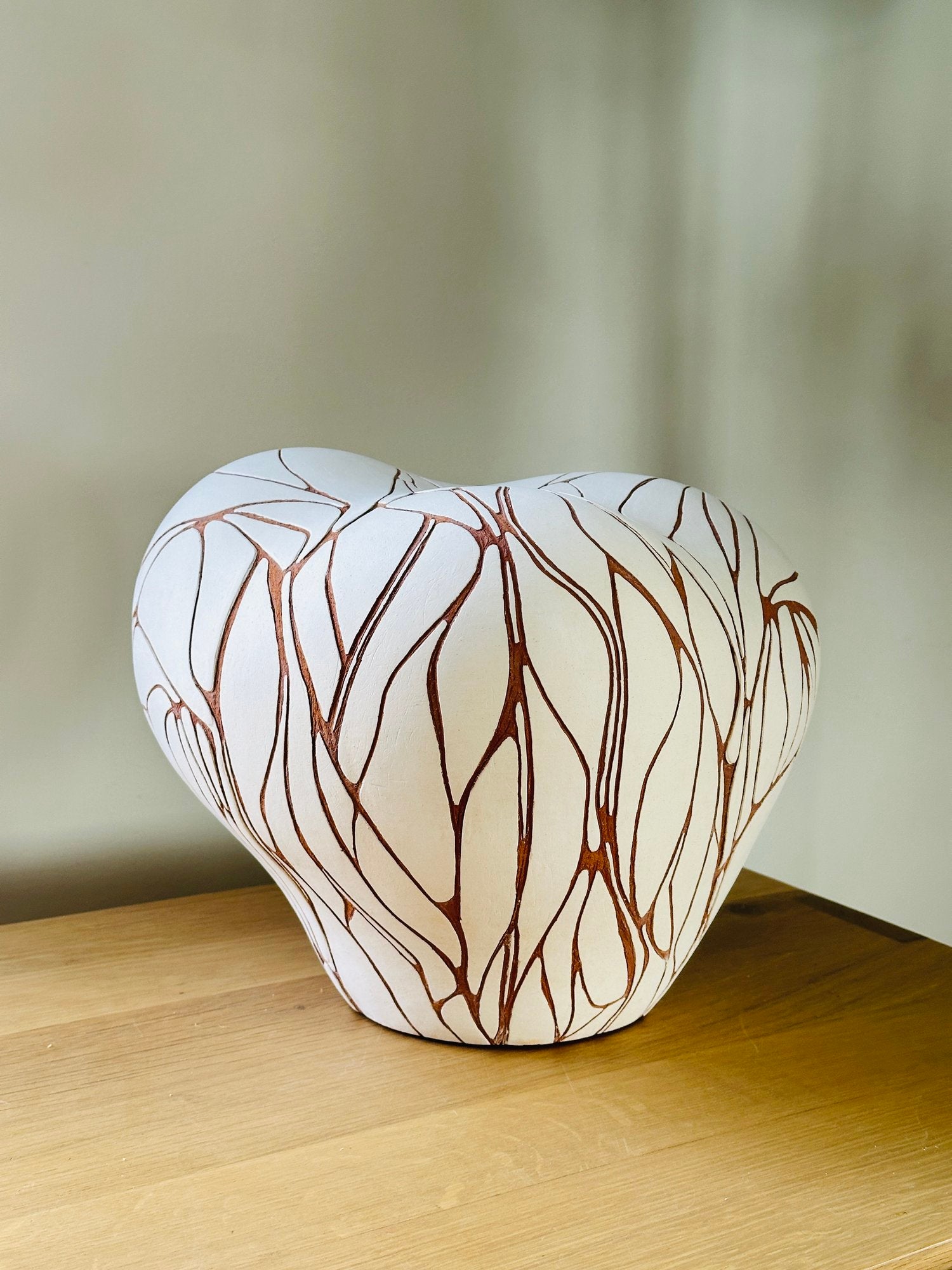
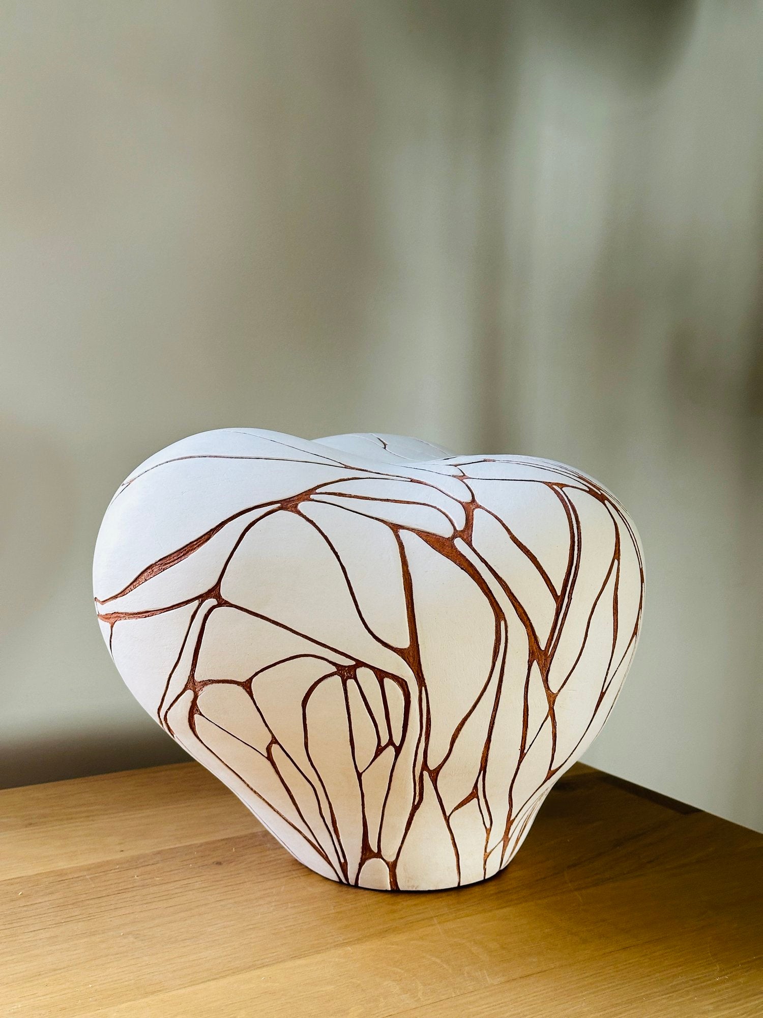
- Dogu Lady 93 (handle: dogu-lady-93): A hand-built stoneware and marble sculpture in refined grayscale. Its figurative silhouette brings quiet gravitas to consoles and pedestals while celebrating the maker’s hand.
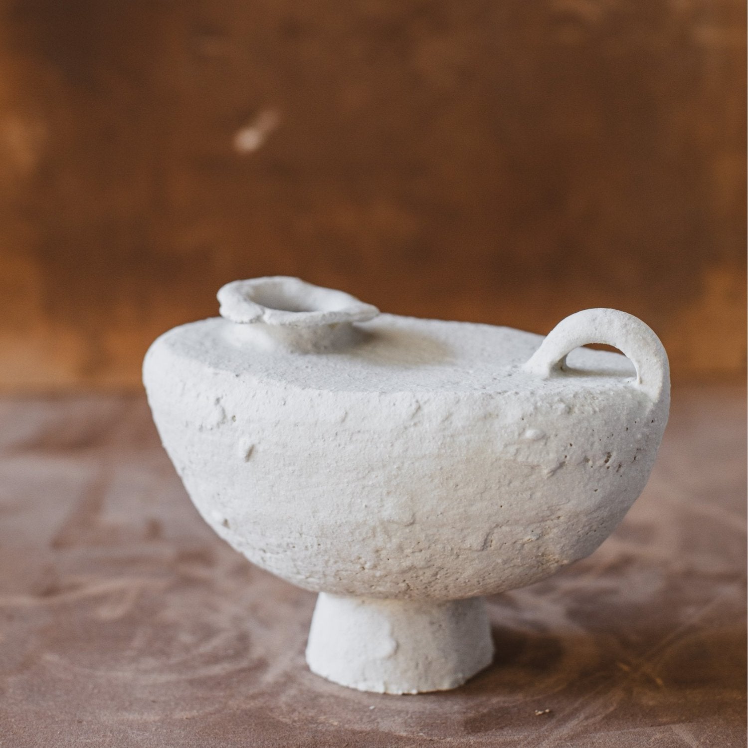
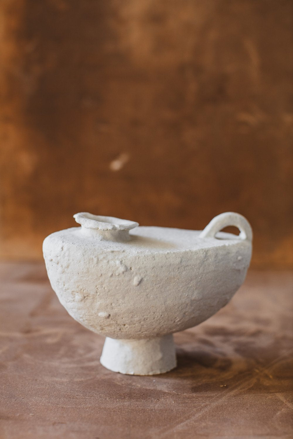
- White Half Moon Jug (handle: white-half-moon-jug): A warm coral-toned porcelain with a half-moon profile that reads as functional sculpture. The soft, layered finish offers a gentle counterpoint to cool stone.
- Topography 16 (handle: topography-16): Hand-built stoneware with topographic relief, a metal accent, and a marble element. Shadowed texture rewards close looking and anchors a minimalist vignette.
- Cloud (handle: cloud): Hand-finished concrete with a velvety surface and subtle red note. A true statement object that will acquire a personal patina over time.
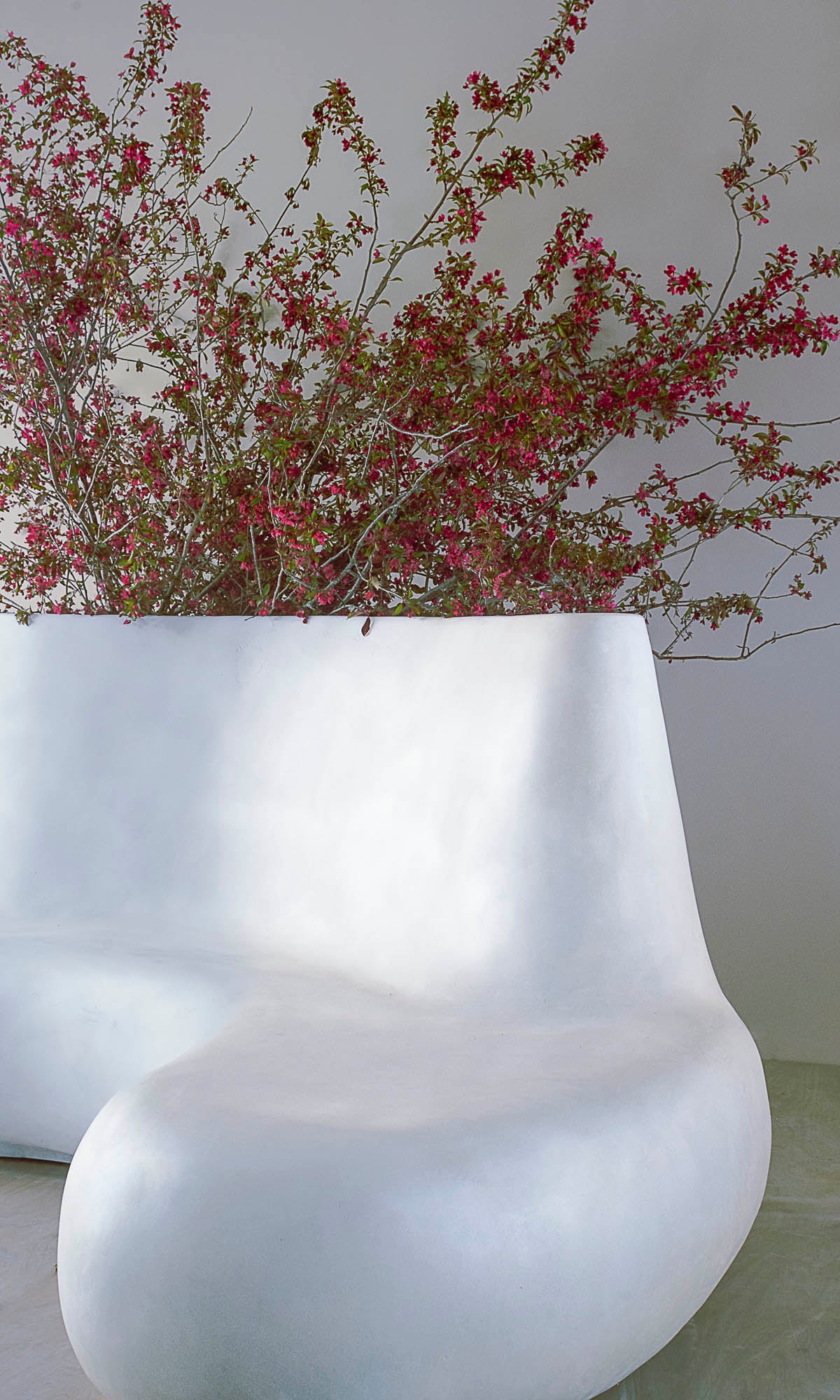
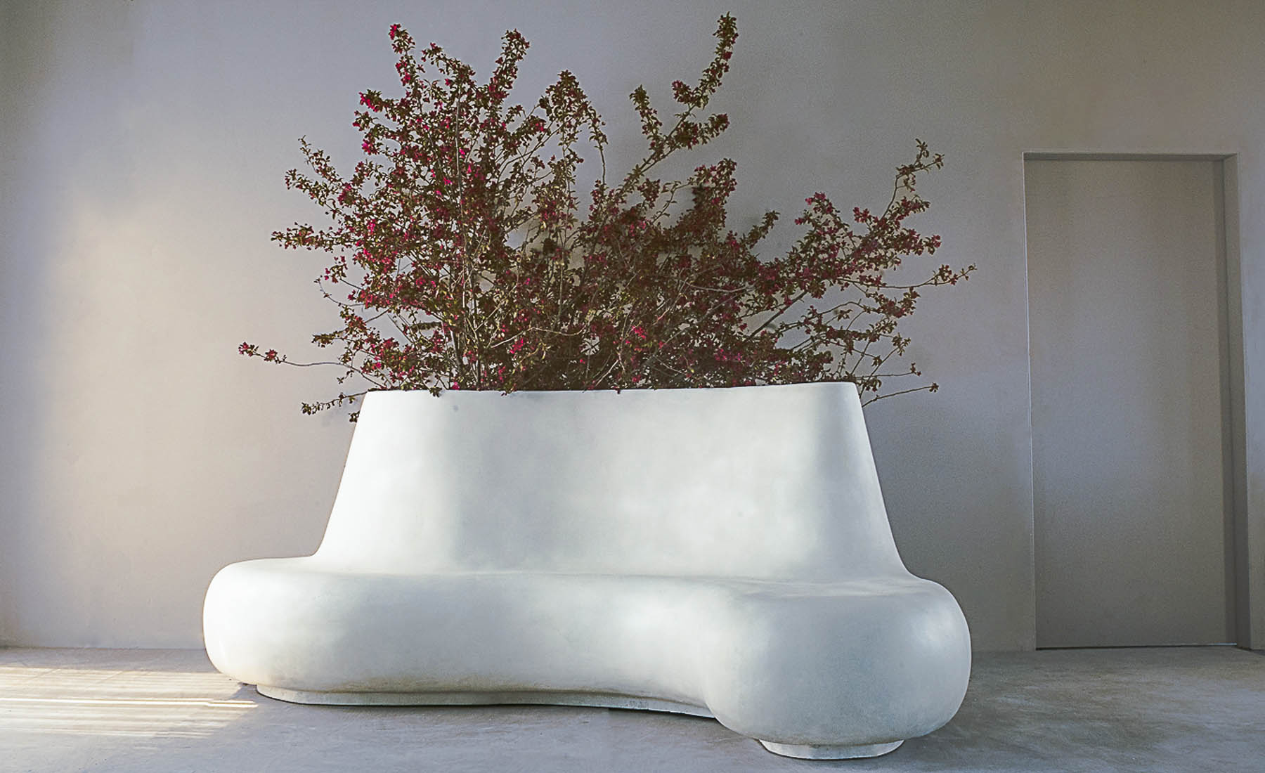
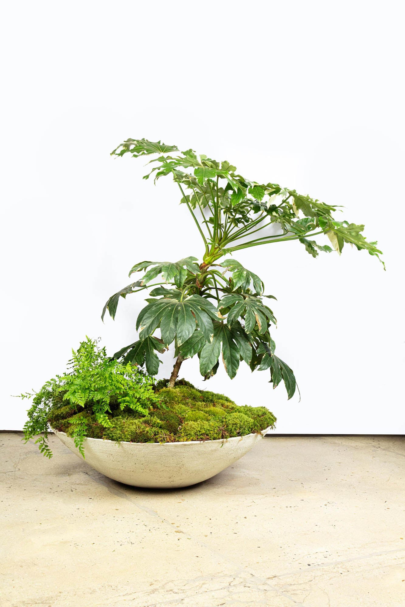
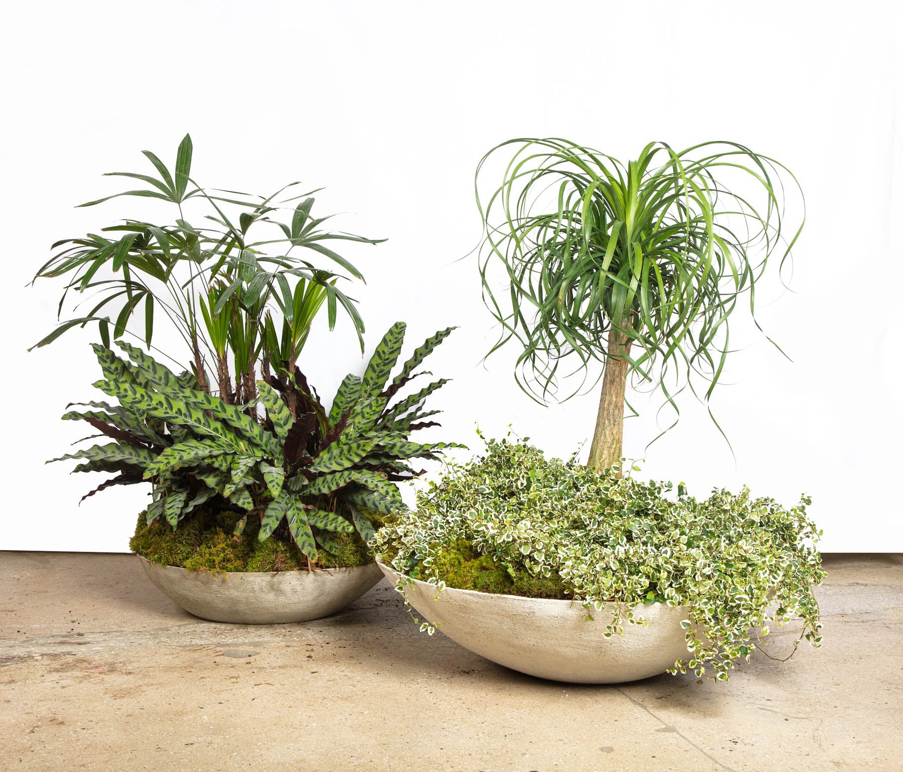
- Ukiyo Floor Saucer (handle: ukiyo-floor-saucer): A refined, low-profile concrete saucer for planters—functional minimalism that protects floors while adding an architectural base to living greenery.
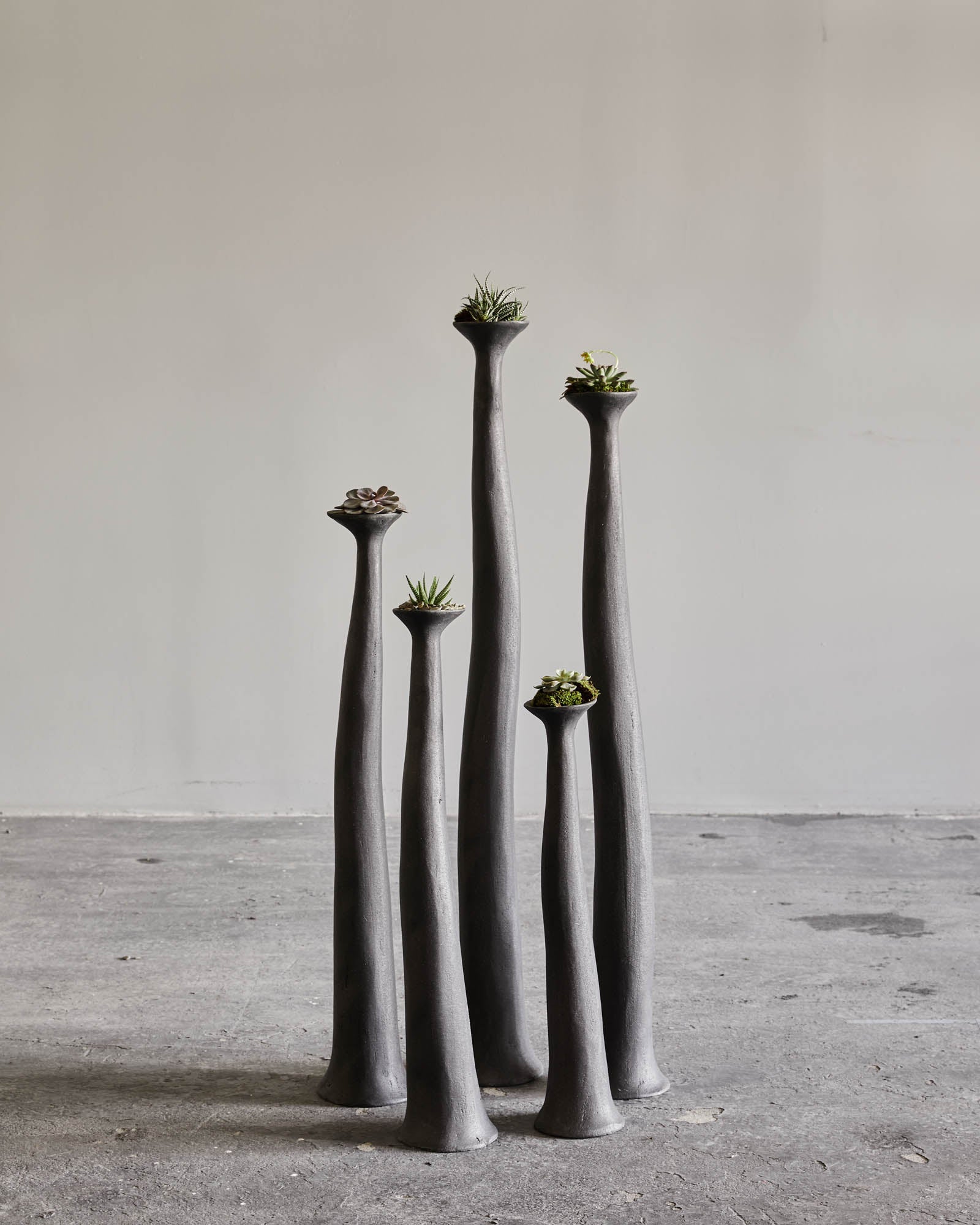
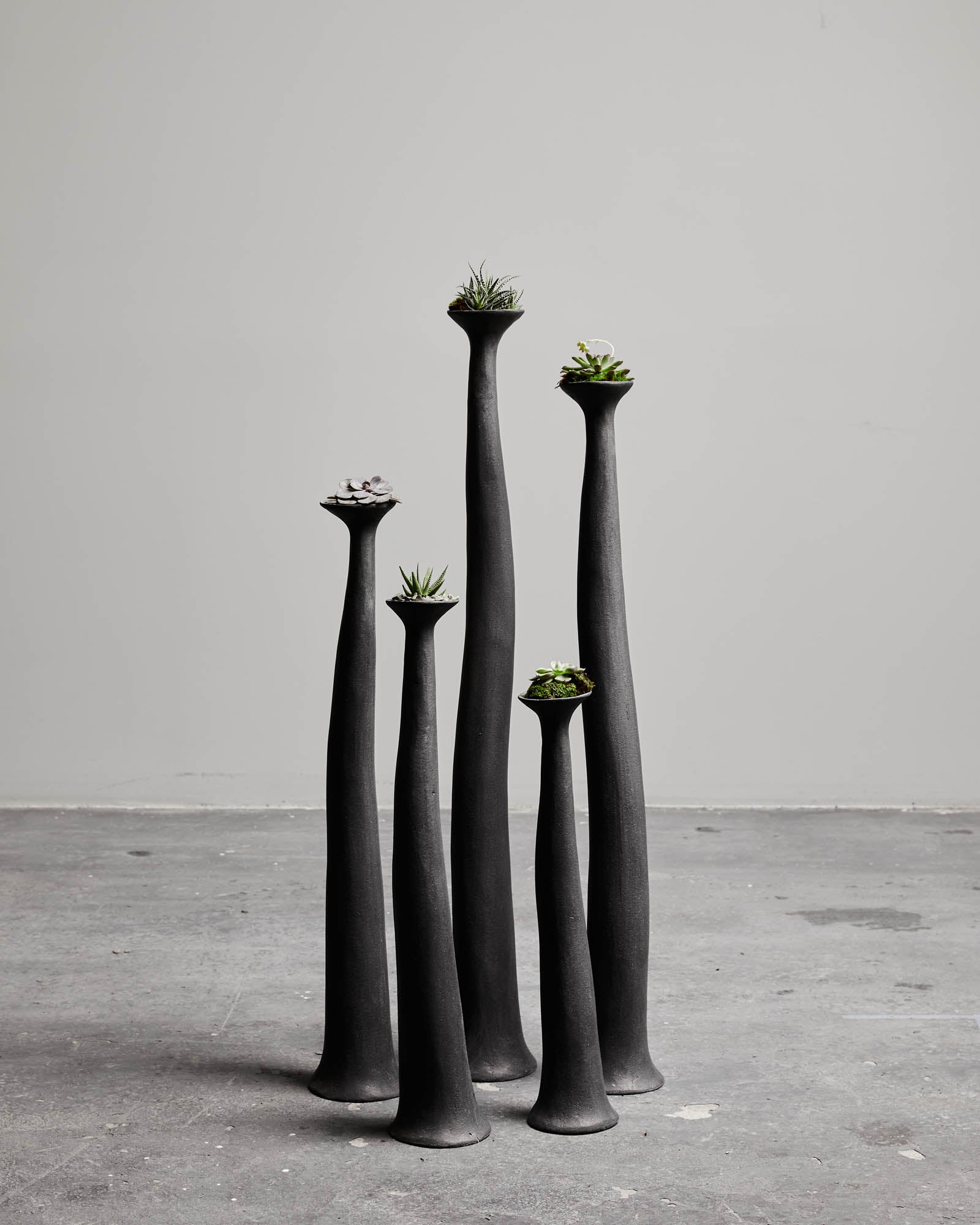
- Hoodoo Stacks (set of 5) (handle: hoodoo-stacks): Modular concrete sculptures that invite re-composition and play. Each stack’s variation is a conversation between balance and impermanence.
- Terra 02 (handle: terra-02): Ceramic paired with hand-formed glass for ambient light. A sculptural object by day; a softly glowing presence by night—ideal for bedside or console styling.
- Black Terra (handle: black-terra): A hand-built ceramic in nuanced white, gray, and black. Its organic silhouette works styled empty or with a single branch.
- Smara Side Table (handle: smara-side-table): Stoneware and marble compose a small table with a quiet profile—tactile warmth meets refined durability, perfect beside a linen lounge chair.
- Shell Sconce 01 (handle: shell-sconce-01): Hand-built stoneware ridges set against a marble backplate. The fixture produces an intimate, atmospheric glow—shadow as ornament.
- Distorted Moon 04 (handle: distorted-moon-04): A sculptural ceramic lamp whose surface variation comes alive in low light. Its gray and earth tones bridge minimalist and organic interiors.
- Drape Wall Lamp (handle: drape-wall-lamp): Stoneware folds paired with metal and marble. Equal parts sculpture and light—a wall moment that feels hand-draped and architectural.
- Leaning Impermanence Wall Lamp (handle: leaning-impermanence-wall-lamp): Brass and steel with leather detail. This leaning form embodies wabi-sabi’s acceptance of change—an artful presence even when unlit.
- Coastal Memory (handle: coastal-memory): Ceramic and metal with a cool gray-and-white base and a precise orange accent. The composition balances calm with a single, purposeful color note.
- Terra III (handle: terra-iii): A stoneware sculpture with marble-influenced palette. Its toned neutrals and weighty stillness make an effortless centerpiece.
- Terra IV (handle: terra-iv): A one-of-a-kind stoneware form that is equally compelling empty or with a few stems. Cool, architectural palette for cross-season styling.
- Ilianthos (handle: ilianthos): Layered gray, white, and beige ceramic. An organic silhouette that catches and softens light on shelves and mantels.
- Aethel (handle: aethel): A cool gray, blue, and white ceramic with restrained glazing—bridging contemporary and traditional rooms with ease.
- Nadine (handle: nadine): A small-batch ceramic in white and gray with a subtle coral accent. A versatile accent for layered styling on smaller surfaces.
Styling guidance: Let each object breathe. Pair a sculptural piece like Cloud with a single vessel—Black Terra or Ilianthos—and complete the vignette with a soft-lit lamp such as Terra 02. The goal is visual stillness: three to five objects maximum per surface, with generous negative space around them.
How to Mix wabi-sabi with Other Aesthetics
Wabi-sabi plays well with quiet, material-forward styles. Here is how to combine it without diluting its character.
- Japandi (Japanese-Scandinavian): Both styles prioritize simplicity and natural materials. Use pale woods, linen, and gray stone as a base; add a sculptural sconce like Shell Sconce 01 and a hand-built vessel such as Terra IV. Keep lines clean and ornament minimal.
- Minimalist Contemporary: Wabi-sabi softens strict minimalism. Introduce a textured focal point—Topography 16—on a monochrome backdrop. Replace glossy finishes with matte or honed surfaces to reduce glare and add tactility.
- Brutalist: Balance mass and roughness with intimacy. Concrete icons like Hoodoo Stacks or Cloud bring weight; offset them with linen, warm off-white walls, and a coral-toned accent like White Half Moon Jug.
- Modern Mediterranean: The limewash, terracotta, and sunlit chiaroscuro of Mediterranean spaces harmonize with wabi-sabi. Use warm whites, clay vessels, and patinated metal. Drape Wall Lamp becomes a natural fit on textured plaster.
- Mid-century Modern: Keep the silhouettes clean, but swap plastic gloss for natural texture. Pair teak or walnut furniture with organic ceramics (Ilianthos, Aethel) and a honed stone side table like Smara for a grounded update.
- Industrial: Temper exposed steel and brick with soft, handmade pieces. Leaning Impermanence Wall Lamp adds warmth through brass and leather, while Black Terra brings human scale to hard-edged rooms.
Mixing principles:
- One language, many accents: Choose a dominant material language (stone, wood, linen) and layer wabi-sabi objects as tonal and textural accents rather than color clashes.
- Control the sheen: Prioritize matte, eggshell, and honed finishes. Reserve any gloss for small moments—glass shades or a polished metal screw—so texture remains legible.
- Limit the color story: Two to three neutrals plus one earth accent keeps compositions coherent across styles.
Common Misconceptions to Avoid
- Wabi-sabi equals shabby: Not at all. Patina is not damage; it is care recorded through time. Surfaces are maintained, not neglected. Materials and craftsmanship remain high quality.
- No color allowed: Color is welcome when used with restraint. Earth-bound hues—rust, coral, moss—enliven gray and bone without overwhelming the palette.
- It must look old: New pieces can be wabi-sabi if they are honest in material and process. Hand tooling, kiln variation, and matte finishes create immediate depth.
- Asymmetry means messy: Asymmetry is intentional, balanced by negative space and proportion. Clutter dilutes calm; edit to the essentials.
- Only Japanese objects qualify: Wabi-sabi is a philosophy, not a passport. Works from Greece, Portugal, France, and beyond can embody the same values of humility and craft.
- Technology is excluded: Technology can coexist when quieted—concealed cables, dimmable lights, and neutral finishes that do not shout. Drape Wall Lamp and Distorted Moon 04 show how tech can feel poetic.
Building an Authentic wabi-sabi Collection
Think long-term, invest in craft, and allow your collection to evolve. Authenticity comes from the relationship between you and the objects—how you use, care for, and re-contextualize them over time.
Collecting strategy:
- Start with anchors: Choose one to three sculptural anchors that define presence and scale in a room. Cloud, Topography 16, or Dogu Lady 93 set the tone for a console or mantel.
- Layer functional sculpture: Lighting and small tables can be artful and useful. Shell Sconce 01 or Drape Wall Lamp transform walls into galleries; Smara Side Table adds a tactile landing place.
- Curate a living palette: Use two cool neutrals (slate, bone) and one warm accent (coral, rust). A single coral jug or a sienna-tinged lamp warms the room without derailing serenity.
- Honor negative space: Leave open areas around your pieces so texture and silhouette register. If a surface feels busy, remove one element and reassess.
- Embrace evolution: Rotate objects seasonally. In winter, lean into deeper charcoals and stone; in spring, bring in pale linen and lighter ceramics.
Purist path versus modern path:
- Purist: Focus on unglazed stoneware, linen, and raw woods. Keep color to mineral neutrals; rely on shadow cast by ridges and folds—Shell Sconce 01 exemplifies this poetry.
- Modern: Introduce honed marble, burnished metals, and subdued color accents. White Half Moon Jug and Coastal Memory demonstrate how a single hue can animate a grayscale interior.
Care and longevity:
- Clean softly: Use dry or slightly damp cloths for ceramic and concrete; avoid harsh chemicals that strip patina.
- Protect from extremes: Even robust materials appreciate consistent humidity and temperature. For concrete and stone, felt pads and coasters prevent accidental etching.
- Celebrate repair: Small chips and hairline cracks can be stabilized and highlighted. Kintsugi-inspired repairs acknowledge life rather than hiding it.
Starter shopping list: balanced, high-impact, and true to wabi-sabi values.
Investment pieces (choose three):
- Cloud (cloud): A sculptural concrete anchor with a velvety matte finish that will gracefully patina—perfect for center-stage placement.
- Shell Sconce 01 (shell-sconce-01): Stoneware ridges and marble backplate produce gentle, atmospheric light—an everyday ritual of turning down the room.
- Topography 16 (topography-16): A richly textured stoneware relief with metal and marble that turns a blank wall or console into a tactile landscape.
Accent pieces (choose three):
- Black Terra (black-terra): Neutral and versatile, ideal for quiet vignettes or a single branch on a sideboard.
- Nadine (nadine): A small but resonant presence—white and gray with a coral whisper—to wake a monochrome arrangement.
- Ilianthos (ilianthos): Gentle, layered neutrals in a hand-formed silhouette that softens shelves or mantels.
Room-by-room suggestions:
- Entry: Dogu Lady 93 on a narrow console, paired with Nadine; keep a low bowl for keys and a single stem.
- Living: Cloud as centerpiece with Terra 02 glowing nearby; Hoodoo Stacks to one side for a changeable composition.
- Bedroom: Distorted Moon 04 for warm, dimmable light; Ilianthos on the dresser; a linen throw to mellow the scene.
- Dining: White Half Moon Jug on the table as a sculptural vase; Terra IV centered on a sideboard; Drape Wall Lamp as an artful sconce duo.
Above all, slow down. Wabi-sabi design invites you to notice the way morning light grazes a ridged sconce, the way a hand-built rim sits just slightly off perfect, the way concrete grows silkier under fingertips. The home becomes a place to observe, to touch, and to live with objects that gently return your attention to the present moment.
Shop Wabi-Sabi Objects at Trove
Explore our curated collections of handcrafted wabi-sabi pieces:
Frequently Asked Questions
Q: What is wabi-sabi style of decorating?
A: Wabi-sabi decorating is a Japanese-rooted philosophy that finds beauty in imperfection, impermanence, and incompleteness. In interior design, it translates to choosing handmade objects with visible irregularities—uneven ceramic glazes, rough-hewn wood, naturally weathered stone—and arranging them in ways that honor negative space and the passage of time. Trove's wabi-sabi collection is curated around this principle, featuring hand-built ceramics, saggar-fired vessels, and sculptural pieces where no two are exactly alike.
Q: How do I choose the perfect wabi-sabi lamp for my home?
A: Look for lamps with handcrafted ceramic or concrete bases that show evidence of the maker's hand—subtle texture variations, organic forms, or natural color gradients from the firing process. The best wabi-sabi lighting casts warm, diffused light that reveals the textures of surrounding objects and walls. Trove's wall sconces and sculptural lamps are designed to function as both light sources and standalone art objects, making them ideal anchors for a wabi-sabi interior.
Q: What is saggar firing?
A: Saggar firing is a centuries-old ceramic technique where pottery is enclosed in a protective container (the saggar) with combustible materials like sawdust, seaweed, salt, or metal oxides during kiln firing. As these materials burn, they produce unpredictable chemical reactions on the clay surface, creating unique patterns of smoke marks, metallic flashes, and color variations that cannot be replicated. Each saggar-fired piece in Trove's collection is genuinely one-of-a-kind, bearing the exact atmospheric conditions of its firing.
Q: What is reduction firing in ceramics?
A: Reduction firing is a kiln technique where the oxygen supply is deliberately restricted during the firing process, forcing the flames to pull oxygen from the clay and glazes themselves. This chemical reaction produces rich, unpredictable color shifts—turning iron-bearing glazes into deep celadons, copper glazes into oxblood reds, and clay bodies into warm toasted tones. The technique is central to many of the ceramic pieces in Trove's collection, giving each vessel its distinctive depth and luminosity.
Q: How do I mix wabi-sabi decor with modern furniture?
A: The most successful approach is to use modern furniture as a clean architectural backdrop and let wabi-sabi objects provide the soul and texture. Place a hand-thrown ceramic vessel on a sleek console, lean a rough-textured wall sconce above a minimal credenza, or set an irregular stoneware bowl on a glass coffee table. The contrast between machine-precise modern lines and organic handmade forms creates visual tension that makes both elements more compelling.
Featured in This Guide
White Half Moon Jug
Topography 16
Cloud
Ukiyo Floor Saucer