Catarina Pacheco: Master of Glass
The luminous language of Catarina Pacheco
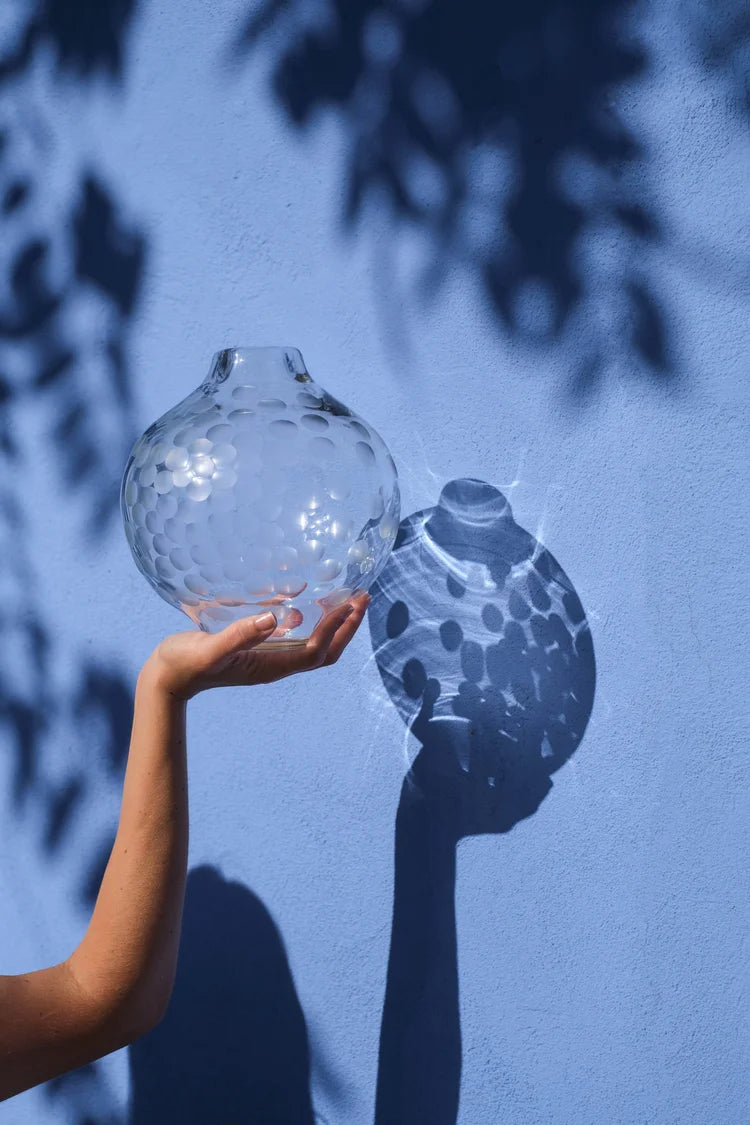
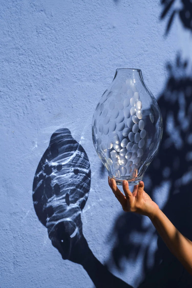
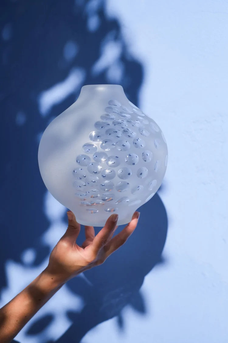
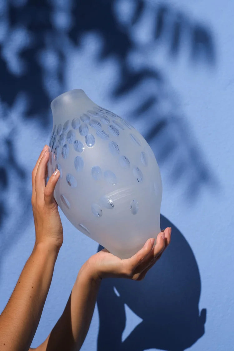
Some artists work with color. Others work with form. Catarina Pacheco works with light itself. In her studio, glass becomes a living surface: catching, bending, and releasing light in a choreography that changes throughout the day. The result is a body of contemporary glass art that feels both architectural and intimate—composed and contemplative, yet animated by every passing sunbeam. To encounter the Catarina Pacheco collection at Trove Gallery is to see the ordinary made radiant.
We feature Pacheco not merely for her exquisite craft, but for the way her work connects spaces and people. Each piece invites a pause—an invitation to watch how color pools, how edges glow, and how a quiet object can transform a room. While many collectors first discover her through searches like ‘Catarina Pacheco pottery,’ Pacheco’s practice today is firmly rooted in glass: a medium that holds light, memory, and time. Her compositions are precise without feeling rigid, and they elevate the mood of modern interiors without shouting for attention.
In this Maker Feature, we trace Pacheco’s aesthetic language and introduce signature pieces from two defining series: Light Echos and Colour Conversation. If you’ve been looking to buy Catarina Pacheco for a living room, a serene bedroom, or a contemplative office space, consider this your guided tour.
From studio to home: how glass holds the memory of light
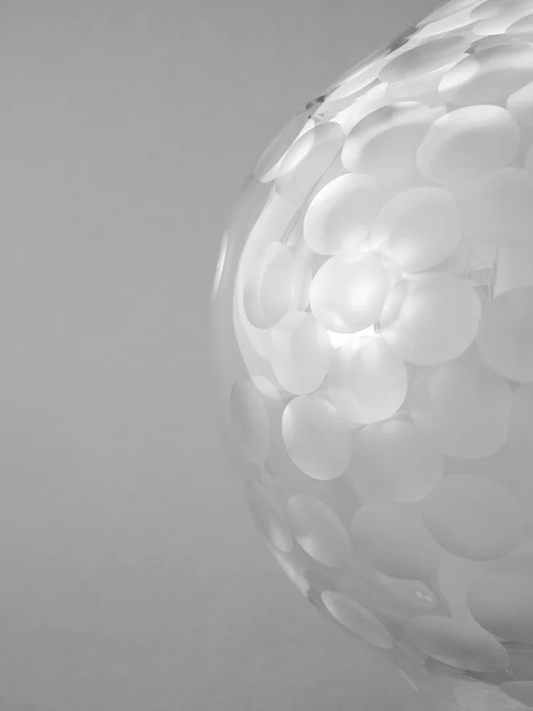
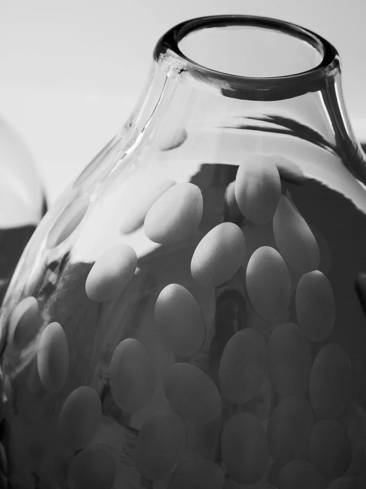
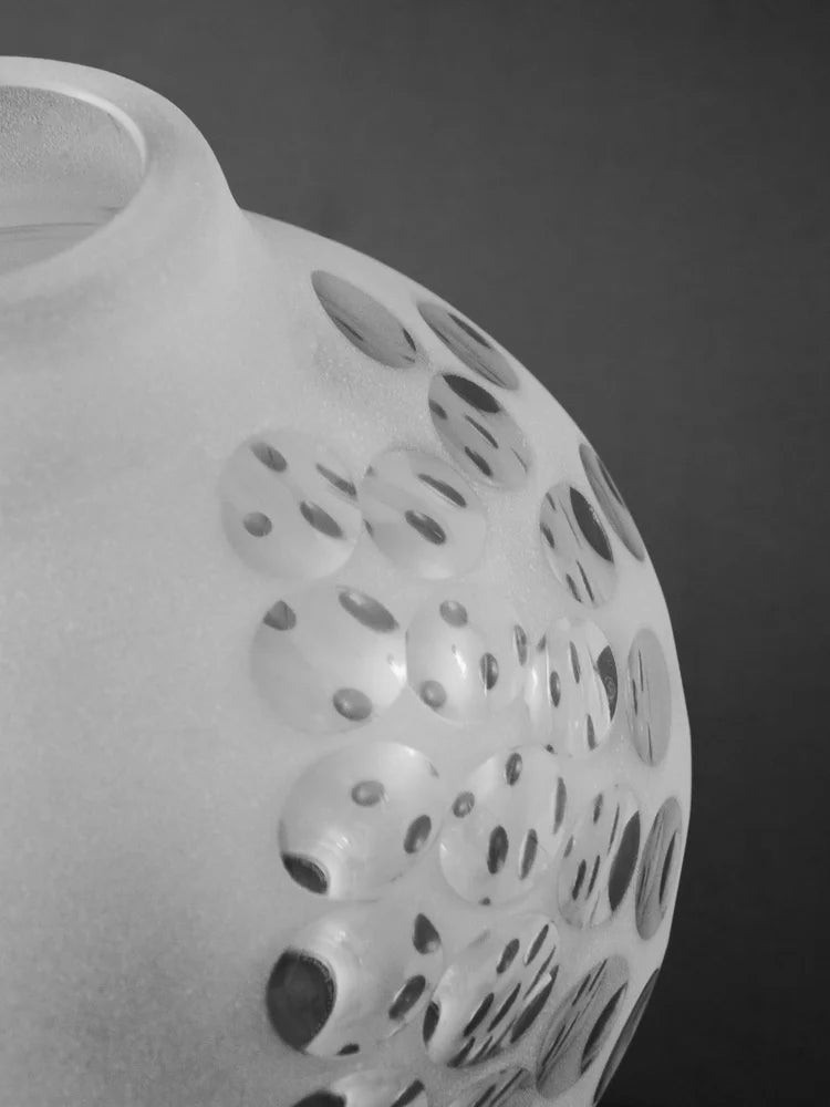
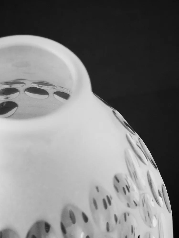
Glass is a paradox. It is both strong and delicate, transparent yet saturated with color. In Pacheco’s hands, it becomes a medium for time. Throughout the day, her works gather illumination, refracting it into hushed halos or crisp edges, then release it as the light shifts. Even after sunset, a lamp’s glow will draw out new tonalities—the dusky blues, the warm ambers, the quiet greys peeking from beneath a surface you thought you already knew.
While the exact processes are part of Pacheco’s studio ritual, what you will feel as a viewer is the clarity of intention. Each piece is formed, refined, and finished with an eye for line, proportion, and chromatic balance. Edges are disciplined. Color fields meet with a considered seam. Every surface is finished to invite the hand without courting distraction. This is slow art with a modern sensibility: made with care, ready to live with, and designed to grow more rewarding in daily use.
That is why Pacheco’s work belongs in rooms where architecture matters—spaces with strong daylight, carefully chosen materials, and an appetite for calm. Place one of her pieces near a window or opposite a soft light source and the room subtly resets. The work becomes a quiet anchor: a focal point that never needs to force your gaze, because it rewards your second look even more than your first.
Collectors often tell us that a Pacheco piece becomes the most photographed object in their home, not just because it’s beautiful, but because it changes. Morning reveals its cool geometry; afternoon unlocks warmth; evening introduces softness. In a world of fast visuals, this slow conversation with light is a luxury in itself.
Inside the Light Echos series
The Light Echos series captures what many of us instinctively love about glass: its ability to hold light as if it were a tangible material. Pacheco shapes color into deliberate fields and lets illumination define the edges, so the composition seems to hum from within. Across the series, you’ll find tonal gradients and measured planes that feel architectural—an invitation to contemplate shadow and brightness as equal partners.
Light Echos I (423.00) sets the tone with a restrained palette and crisp transitions. It’s a study in clarity: a beautifully balanced composition that works as a single statement on a console or shelf, or as a starting point for a grouping. We recommend placing it where natural light can skim across its face; the piece will respond by softening and intensifying at different hours.
Light Echos II (438.00) adds a touch more complexity—a gentle escalation in chroma and interplay between planes. Where Light Echos I feels like a breath held, II is the exhale: still meditative, but more open. It pairs naturally with I for a quiet diptych that reads as one conversation, two cadences.
Light Echos III (466.00) shows Pacheco’s control of gradation. Colors don’t collide; they taper into one another, creating a subtle glow where they meet. If your interior leans minimal, III adds warmth without clutter—a soft beam that threads the line between sculpture and light source without becoming either.
Light Echos IV (481.00) feels serene and assured, like the calm after a storm. Slightly more saturated passages bring a confident presence that holds its own on a mantel or pedestal. In contemporary homes, IV can be the anchor piece that organizes the surrounding textures—stone, wood, linen—into a more harmonious whole.
Two indigo-led compositions extend the series’ linguistic range. Light Echos Indigo I (525.00) harnesses deep blue to create a grounded, contemplative mood. Place it in a reading corner or a bedroom and watch how it cools and settles the space—never cold, always thoughtful. Light Echos Indigo II (554.00) brings a slightly brighter, more luminous indigo, sharpened by lighter planes that read like the last glint of twilight. The pair is a collector’s favorite: Indigo I as the velvet dusk, Indigo II as the lingering afterglow.
Together, Light Echos I–IV and the Indigo works form a flexibly curated family. Arrange any two for a conversational duo, three for a tranquil triptych, or more to build a tonal rhythm along a sideboard or stair landing. Each piece is individually handcrafted, so subtle variations become part of the charm—evidence of the artist’s touch and the material’s living response to light.
Colour Conversation: when pigment becomes voice
If Light Echos is about light’s echoing presence, Colour Conversation is about color’s voice. In this series, hue becomes the protagonist, articulated in planes that feel both painterly and sculptural. Pacheco lets two or three tones meet in dialogue; what happens at their borders is the real story. A thread of tension. A meeting point that glows. A line that refuses to resolve too quickly, inviting the eye to linger.
Colour Conversation XI (583.00) is an elegant example of Pacheco’s control over contrast. Here, richly saturated fields negotiate with quieter neighbors, and the line between them feels less like a boundary and more like a shared breath. This is a piece that thrives in dining rooms or entryways—places of social exchange—because it sets the tone without dominating the conversation.
Colour Conversation XII (583.00) shifts toward a calmer register: still articulate, but tempered. The intervals between colors are more spacious, the pauses longer. If you’re building a serene palette around soft woods, pale stone, and diffused lighting, XII will hum in the same key, becoming an anchor point that quietly elevates the entire composition of your room.
Collectors who love contemporary painting are often drawn to this series because it reads like color-field art translated into glass. But there’s a crucial difference: where paint absorbs illumination, glass shares it. Colour Conversation works do not sit on the wall so much as they breathe with the room, changing from clear articulation to soft murmur as daylight wanes. That responsiveness is what makes them such enduring companions.
How to style glass art: a collector’s guide
Good glass art doesn’t just occupy space; it edits it. Pacheco’s work excels at this because it is visually crisp yet atmospherically soft. Whether you’re building a gallery wall, curating a shelf, or anchoring a room with a single statement, here are principles we return to when styling the Catarina Pacheco collection.
Begin with light. Place pieces where illumination is indirect and dynamic. Opposite a window, they’ll gather ambient glow without glare; near a sheer curtain, they’ll translate soft daylight into color you can almost touch. If your room lacks strong natural light, a dimmable lamp nearby will reveal a surprising range—try warmer bulbs to heighten amber and blush tones; cooler bulbs will deepen blues and greys.
Consider the background. Neutral surfaces—plaster, limewash, pale oak—make Pacheco’s compositions read with clarity. If your walls are darker, let the piece sit where a splash of light can find it; the contrast will heighten the sense of inner illumination. Stone consoles, matte metal shelves, and linen-covered plinths provide grounding textures that complement the glass without competing.
Think in pairs and cadences. Light Echos I and II form a lyrical duo that reads like variations on a theme. Indigo I with Indigo II conjures dusk and twilight. Colour Conversation XI and XII create a refined call-and-response. Arrange them with a small interval between pieces so your eye can rest; the gap becomes part of the rhythm.
Let silence do some of the work. In design, negative space is not empty; it’s active. Give a Pacheco piece breathing room and it will reward you with presence. If you’re integrating it among books or ceramics, stagger heights so the glass isn’t blocked and keep adjacent textures matte, allowing the work’s subtle lustre to lead.
Finally, live with it. One of the great pleasures of Pacheco’s glass is discovering how it changes in your home. Move it seasonally. Watch how winter light pulls unexpected greys to the surface, how summer sunlight intensifies a whisper of gold. This is slow design at its most satisfying: patient, observant, personal.
Why collectors choose Catarina Pacheco
There are many reasons design lovers gravitate to Pacheco, but they tend to cluster around a few shared values. First is the clarity of vision. Each work feels inevitable, as if the composition found its truest form—nothing to add, nothing to remove. That restraint is a hallmark of serious craft, and it’s what makes these pieces so compatible with a wide range of interiors, from minimal to transitional to warmly eclectic.
Second is material intelligence. Glass can easily become showy; Pacheco resists that impulse. She favors luminous subtlety over spectacle, crafting surfaces that invite proximity. From the careful meeting of color fields to the precision of an edge, you see and feel the discipline. Even when a piece carries deeper saturation—such as Light Echos Indigo I (525.00) or Light Echos Indigo II (554.00)—it retains composure. The result is luxurious without pretension.
Third is longevity. A Pacheco artwork is not a passing trend; it’s a way of orienting a room around calm. You will still be discovering new tonal registers a year from now. That is why many clients begin with one piece and return to build a small constellation—adding Light Echos III (466.00) opposite a reading chair, or introducing Colour Conversation XI (583.00) near the dining table where evening light gathers.
It’s also why the artist resonates with those searching for the phrase ‘Catarina Pacheco artist’: the work speaks to people who value a maker’s hand, not just a style. While you may come across references to ‘Catarina Pacheco pottery,’ the heart of her practice in this collection is glass—handled with a sculptor’s sense of volume and a painter’s sensitivity to hue. That blend of disciplines is rare, and it’s exactly what makes these pieces collectible.
At Trove Gallery, every Pacheco work we carry is curated for coherence across the line and flexibility within your home. If you want to buy Catarina Pacheco for a specific space, the best approach is to think about the role you want light to play. Do you want a steady, luminous anchor? Consider Light Echos IV (481.00). Looking for a color-forward piece that still speaks softly? Explore Colour Conversation XII (583.00). The beauty of this collection is that there is no wrong choice—only different tones of serenity.
Featured works to begin your collection
For new collectors, we often recommend starting with a Light Echos composition and pairing it with a Colour Conversation piece. This gives you two registers of the same voice—one tuned to light’s behavior, the other to color’s dialogue. Begin with Light Echos I (423.00) for its elegant restraint; it’s an instant lesson in why Pacheco’s work is so widely admired. Then add Colour Conversation XII (583.00) to introduce a complementary mood—more chromatic presence, still serene.
If blues and twilight tones anchor your interior, shift your starting point to Light Echos Indigo I (525.00) and Light Echos Indigo II (554.00). Together, they establish a contemplative spectrum that pairs beautifully with pale oak, travertine, soft wool, and brushed steel. They also sit comfortably with art photography and minimal painting, acting as a bridge between mediums.
For a stronger architectural statement, assemble a trio: Light Echos II (438.00), Light Echos III (466.00), and Light Echos IV (481.00). Place them along a long console or stagger them across open shelving to create a rhythm that reads as a single installation. The variations in tone and intensity feel purposeful, like movements of a score.
Whichever path you choose, you’ll find that the collection rewards slow looking and attentive placement. It’s the kind of art that reveals your taste quietly—an elegant tell for those who notice details.
Shop the Catarina Pacheco collection
When you’re ready to bring this luminous language home, explore the full Catarina Pacheco collection at Trove Gallery. Each work featured here—including Light Echos I (423.00), Light Echos II (438.00), Light Echos III (466.00), Light Echos IV (481.00), Colour Conversation XI (583.00), Colour Conversation XII (583.00), Light Echos Indigo I (525.00), and Light Echos Indigo II (554.00)—is selected for its ability to harmonize with contemporary interiors while retaining the soulfulness of a maker-led practice.
If you’re searching for ‘buy Catarina Pacheco’ with a specific space in mind, our curators are glad to help you choose the right tone, size, and mood. Reach out with a photo of your room and the kind of light it receives, and we’ll guide you toward a piece that clarifies your space in exactly the way you want. For gifts, consider starting with Light Echos I: it’s universally loved, immediately graspable, and surprisingly transformative.
In an era of fast design, Pacheco’s work reminds us that the most modern luxury is attention—paid to light, to color, to the atmosphere of a room. Bring that attention home. Shop the Catarina Pacheco artist page to discover the full range, and welcome a quiet, luminous companion into your daily rituals.
Ready to begin? Explore, select, and collect today at Trove Gallery—and let the light do the rest.